Case study · Transform
Making the Invisible Visible
Designing transparency for complex data relationships.
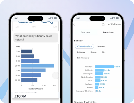
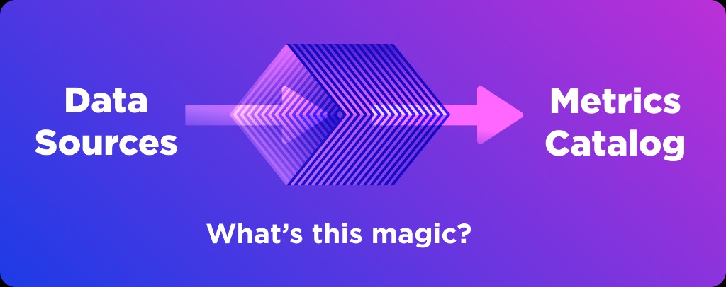
Transform had matured into a powerful semantic layer product, and customers were using it to build large, trusted metric libraries that saved analysts meaningful time. But that same automation created a new problem: because the platform handled joins, metric logic, and outputs behind the scenes, many users experienced the product as a black box and struggled to verify how certified metrics were actually constructed.
This project explored how to make the semantic layer legible. My goal was to design a new interface that helped analysts inspect relationships, compare models, and understand the logic underneath their metrics without overwhelming them with unnecessary complexity.

The problem
Customers were doing the hard work of building and certifying metric libraries inside Transform, but they had limited ways to inspect or communicate the value of what they had built. Analysts wanted more than correct outputs; they wanted a way to understand and show how the system worked, both to build trust internally and to give proper credit to Transform for the complexity it was handling.
The core design challenge was not simply "how do we display metadata?" It was "how do we make a highly technical system feel explorable and trustworthy?" Users wanted to validate joins, compare one model to another, and inspect the underlying logic for specific elements.
Goals ✨
- Understand how customers currently think about and validate their data models.
- Learn what kinds of interfaces would help them explore the semantic layer more confidently.
- Surface the right amount of information at the right time, without overwhelming detail-oriented users.
- Make Transform's hidden work visible, so the platform felt more like an open ecosystem and less like a black box.
Discovery Phase
Kickoff
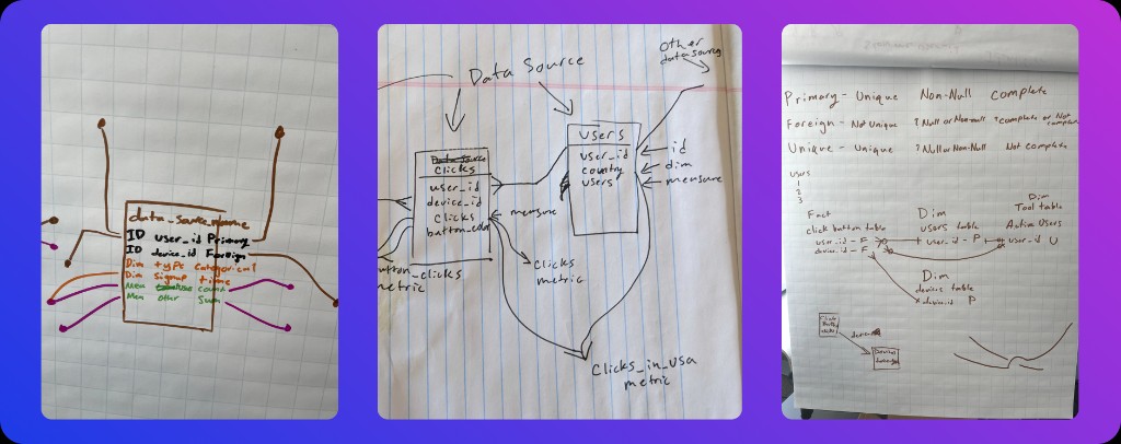
The project began with a kickoff in Detroit, where I worked directly with CEO Nick Handel to frame the opportunity. Our early conversations centered on entity relationship diagrams, or ERDs, which are commonly used to represent entities and their relationships in a structured system, and we explored what it might mean to reinterpret that idea for a modern semantic layer product.
From there, I interviewed subject-matter experts and industry leaders, including people from companies like Snowflake and Airbnb, to understand where customers were getting stuck and what jobs this kind of tool might actually support. Those conversations opened up several possible directions and made it clear that this was a blue-sky but high-value opportunity: users needed both visibility and focus, not just more raw information.
Concept Evaluation
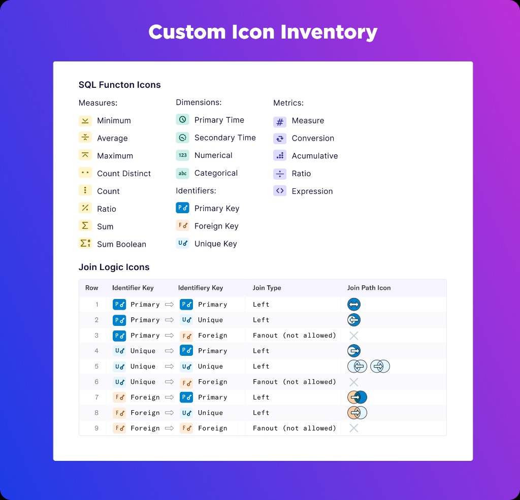
Custom wayfinding icons
I created multiple prototypes to test different ways of revealing the information inside the semantic layer. This included a new iconography system designed to reveal SQL logic. It helped users quickly distinguish measures, metrics, dimensions, and identifiers, as well as a Join Logic Diagram that clarified how data relationships were formed across different join types.
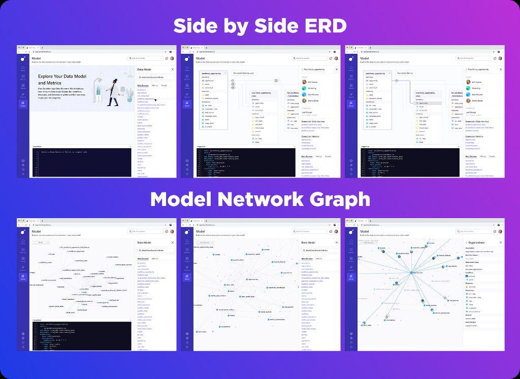
We tested two directions
I explored two main product directions. The first was a side-by-side ERD discovery tool that exposed many relationships and data sources at once; the second was a multidimensional model map that let users navigate relationships progressively and inspect one information card at a time.
Validation
Less is more
User feedback strongly favored the multidimensional model map. Participants found the all-at-once ERD view too cognitively heavy, while the more focused map gave them a clearer way to compare models, inspect details, and validate logic without losing orientation.
That response was an important product insight: in complex systems, transparency is not the same as dumping every layer on screen. A well-designed model of progressive disclosure gave users more confidence precisely because it organized complexity into something they could meaningfully navigate.
Live prototype
I've always wanted to see the semantic layer model map as a working product, not just a concept. That's part of why this project still matters to me: it sits at the intersection of systems thinking, interface invention, and the challenge of making invisible complexity feel understandable.
Building a live version of this concept became a natural continuation of the original design intent. The demo you see below demonstrates both the product vision and my approach to rapid prototyping with AI-assisted development. It's a meaningful example of how design thinking translates into functional software, making a powerful system feel visible, navigable, and human.
Inventing complex solutions
This project pushed beyond standard UX patterns into the territory of new product invention. The designs introduced an interface concept that had not been built before inside the product, while still remaining grounded enough that engineering could realistically imagine implementation.
That balance mattered. Our front-end developer described the project as a dream scenario: ambitious enough to feel new, but specified clearly enough to feel buildable. For me, that was a strong signal that the work had landed in the right zone between vision and execution.
Acquisition
When Transform leadership shared the semantic layer model map with dbt Labs during acquisition conversations, the work clarified how Transform's approach to transparency and exploration could strengthen dbt's semantic layer strategy.
The designs demonstrated a credible path for making complex data relationships understandable and auditable, which aligned directly with dbt's vision of centralizing trusted metrics. That clarity helped accelerate the deal. Transform was successfully acquired by dbt Labs, and while the product didn't ship in its original form, the conceptual direction influenced how dbt approached semantic layer tooling.
For me, this project is a strong example of design work influencing business outcomes, not just through shipped features but through the strategic vision it made visible.