Case study · Transform
Building a world-class dashboard system in three months
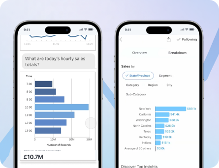
Dashboards even a novice can love.
After validating our earlier strategic assumptions, Transform moved forward with a major pivot. The company was ready to unlock the full value of its metrics platform by enabling analysts to query, visualize, and build dashboards in a way that felt more intuitive, flexible, and responsive than traditional BI tools.
The problem
Transform had a powerful semantic layer, but the product still needed a more visible and compelling way to prove its value to a broader audience. To reach market fit, we needed to turn that underlying technical power into a user experience that helped analysts and business users move from trusted metrics to useful dashboards without getting lost in the complexity.
The challenge was not just building charts. We were designing an interconnected system that spanned query creation, chart configuration, and dashboard layout, all while trying to make the experience feel simpler than the legacy tools users already knew. Dashboard UX guidance consistently warns that overly complex layouts and workflows reduce clarity and adoption, especially when too much information competes for attention at once.
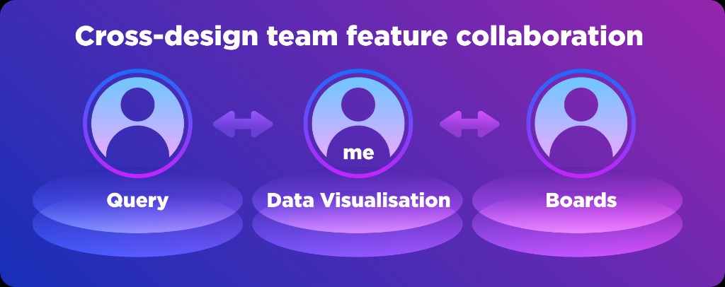
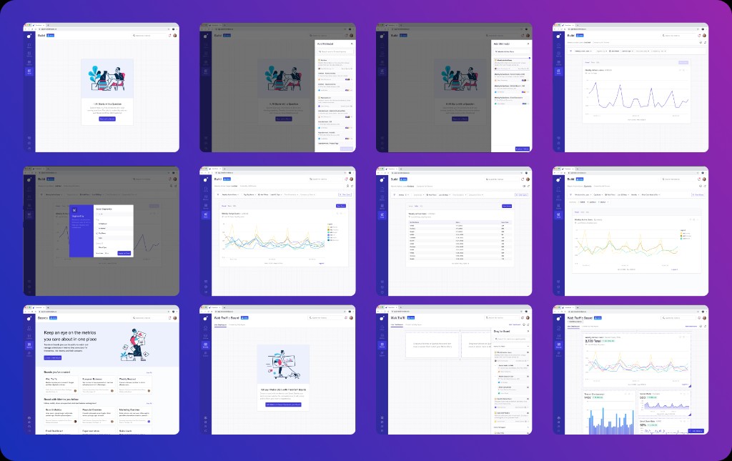
I partnered with a team of three designers to bring this new platform to life. One designer focused on the query engine inputs, another shaped the drag-and-drop dashboard layout system, and I led the data visualization object model, designing the charting experience itself and creating the kind of responsive visualization system I had always wanted to build.
Goals ✨
- Create a query-to-chart-to-dashboard workflow that felt easier than traditional BI tooling.
- Make metrics more approachable for business users who think in terms of outcomes, not database structures.
- Give analysts the flexibility and visibility they needed while building.
- Enable responsive dashboards that worked across desktop, tablet, and mobile without extra layout work.
- Prove the value of Transform's semantic layer through a much more visible and usable product surface.
Understanding user pain points
I started with a competitive analysis of existing dashboarding platforms to better understand where user frustration lived and where there was room for differentiation. Industry guidance on dashboard UX repeatedly emphasizes that products succeed when they reduce cognitive load, reflect real user goals, and simplify access to key metrics.
That work surfaced three especially important findings. First, products like Tableau and Looker often introduced business users to data through table- and field-oriented workflows that felt intimidating, while metrics were easier for those users to reason about conceptually. Second, users wanted more flexibility to change chart types and sizes directly from the dashboard instead of jumping back and forth between isolated editing views. Third, users expected their finished dashboards to work well across devices without requiring additional manual layout adjustments.
Kickoff
Once the early concepts came together, leadership called an all-hands meeting in San Francisco to align the company around the pivot. A shift of this size naturally created a mix of excitement and caution across the team, so engineer Lucas Valente and I made a playful internal music video to get everyone energized about the work ahead.
What started as a one-off morale boost became the anthem of the summer. It gave the team a shared sense of momentum and helped turn a high-stakes pivot into something people could rally around together. The final cut of this video is at the end of this case study.
User Research
We were surprised by how eager our users were to try this new tool
After the three designers completed the initial concept work, we combined it into an end-to-end prototype that covered query building, chart creation, and dashboarding. We tested the flow with both data analysts and business users, because the product needed to work for people with very different mental models and comfort levels. Dashboard research consistently recommends grounding design decisions in real user roles, behaviors, and decision-making needs.
The study revealed a few important surprises. Business users felt intimidated by the metric-selection flow and the number of steps required to create a chart, so we needed to provide more visible progress and immediate feedback as the query took shape. Analysts, on the other hand, disliked the extra click we introduced by hiding the data tables, and wanted tabular information to remain visible throughout the query-building process.
Synthesis
These findings sharpened the distinction between two user needs. Business users needed reassurance, momentum, and clearer visual feedback, while analysts needed persistent access to the underlying data so they could build with confidence and speed. Strong dashboard UX often depends on matching the interface to the user's level of decision depth, rather than assuming one mode fits everyone equally.
That gave us a clear direction. Instead of treating querying, charting, and dashboarding as separate steps, we evolved the system into something more fluid, where users could see progress as they built and adjust outputs without losing context.
Responsive charting guidance
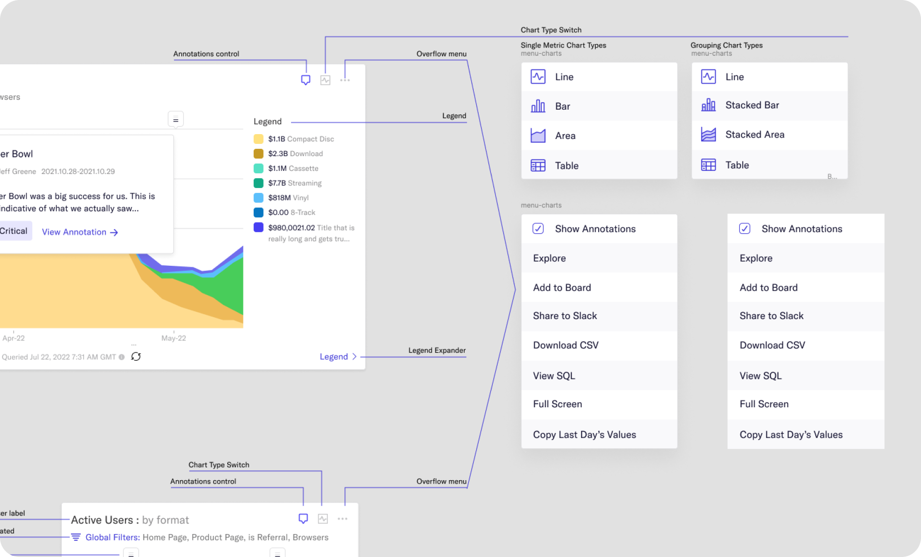
Chart type switch specifications
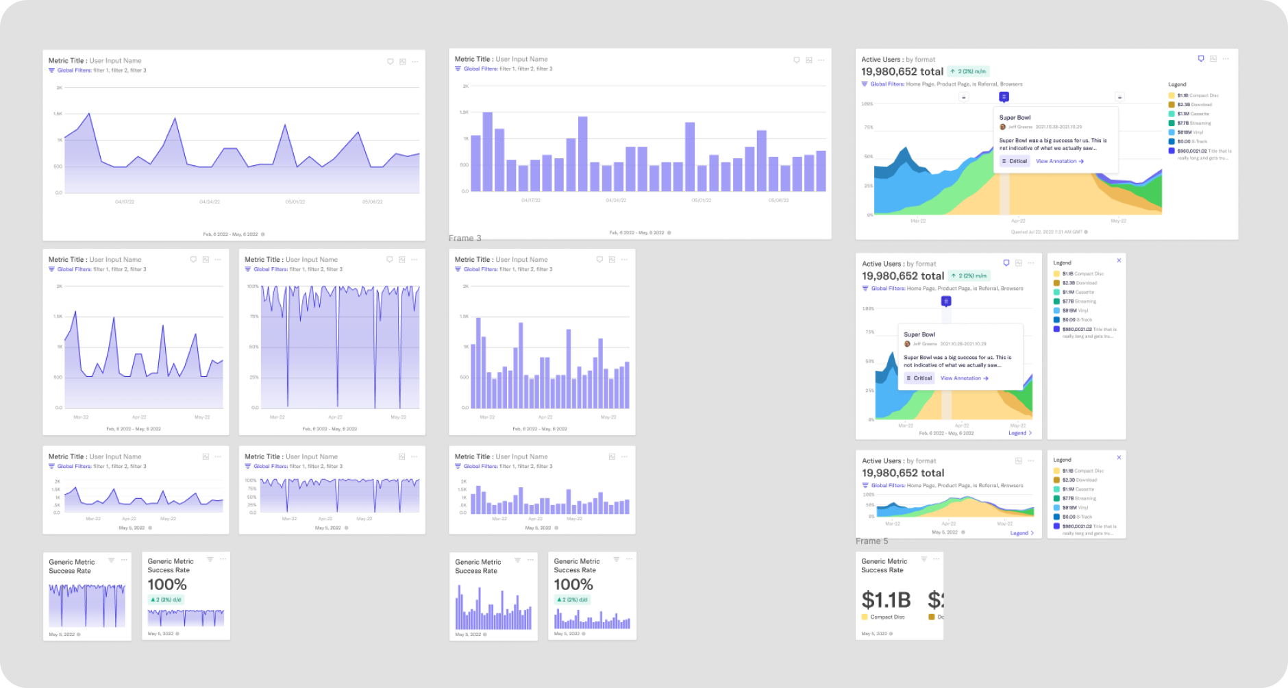
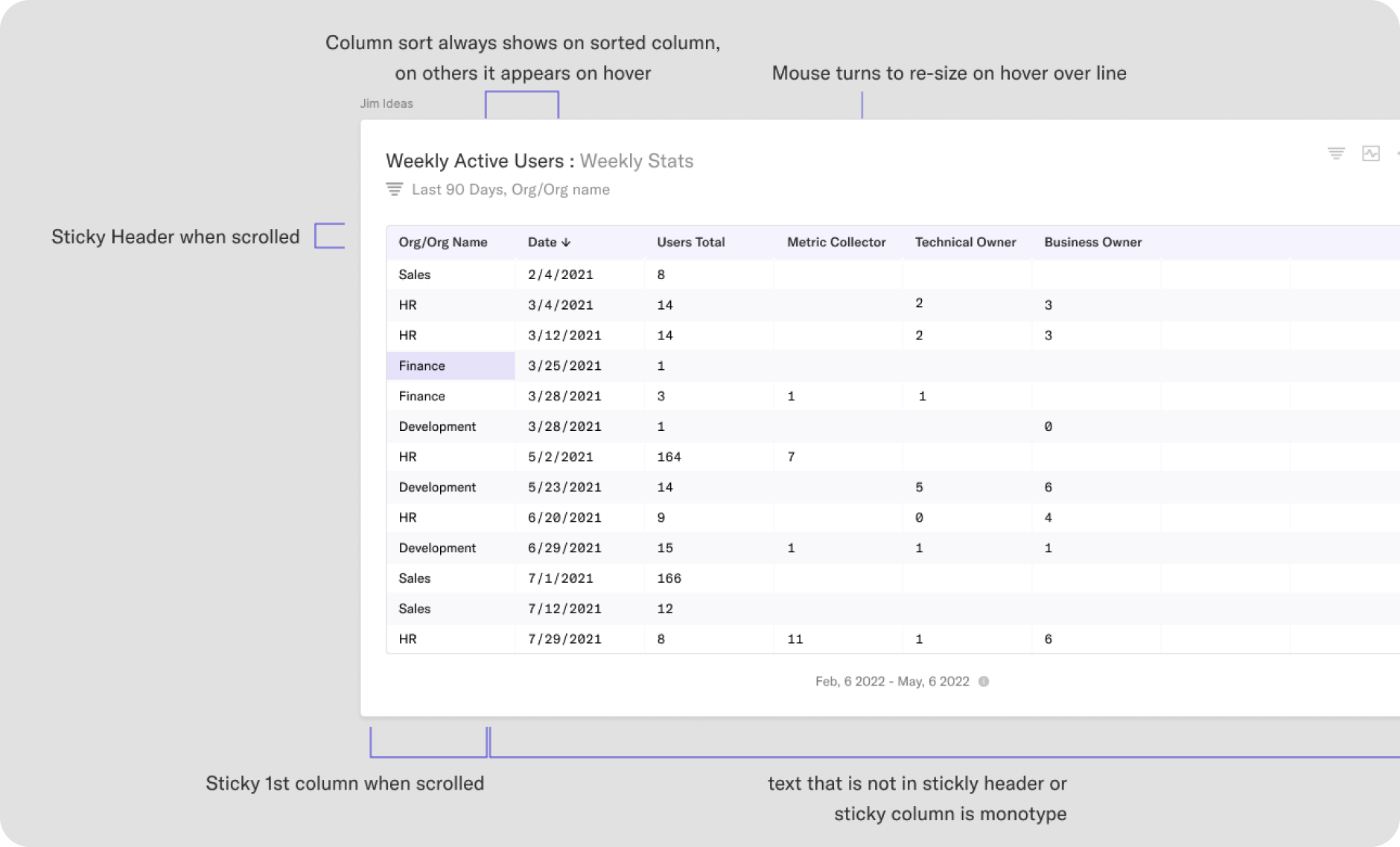
Table design
Launch
In just three months
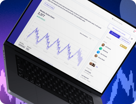
The new data visualization platform shipped to production. The response was strong: weekly active usage increased, requests for additional chart types and capabilities started coming in quickly, and the new feature set helped Transform reach a much clearer point of market fit.
Most importantly, the platform made the value of the semantic layer visible to a much wider audience. Instead of living as a powerful but abstract infrastructure layer, Transform now had a user-facing product experience that customers could see, use, and advocate for.
To celebrate the launch, I re-cut the kickoff video using real product footage. What stood out most was how consistent the vision remained from the earliest concepts through the shipped experience.
Outcome
The business impact was significant. Following the release of the new querying, visualization, and dashboarding experience, Transform's conversion rate from trial to paid customer increased by 72 percent.
For me, this project is one of the strongest examples of design as systems thinking under pressure. We took a major strategic pivot, turned it into a cohesive product experience in three months, and created a platform that users not only adopted, but actively wanted more from.
The project demanded speed, collaboration, strong research instincts, and a deep understanding of visualization design, and it showed me how much impact a well-crafted product vision can have when a team commits to it fully.